Widgetized Section
Go to Admin » Appearance » Widgets » and move Gabfire Widget: Social into that MastheadOverlay zone

Praise The Lord! S&W Has A New Website
 The only thing that kept Smith & Wesson’s website from being the worst in the industry was Beretta USA’s site. A couple months ago, maybe more, the 500+ year-old Italian gun making juggernaut launched a new site and thus a vastly improved online experience for Beretta’s customers and fans, of which I am one.
That left poor old S&W all alone at the top of the crappy website heap. Now the site wasn’t completely awful, it simply did not fit such a strong brand, and particularly one on the rise. Well the wait is over, my friends.
Lo and behold, the new S&W website is up….and I like it.
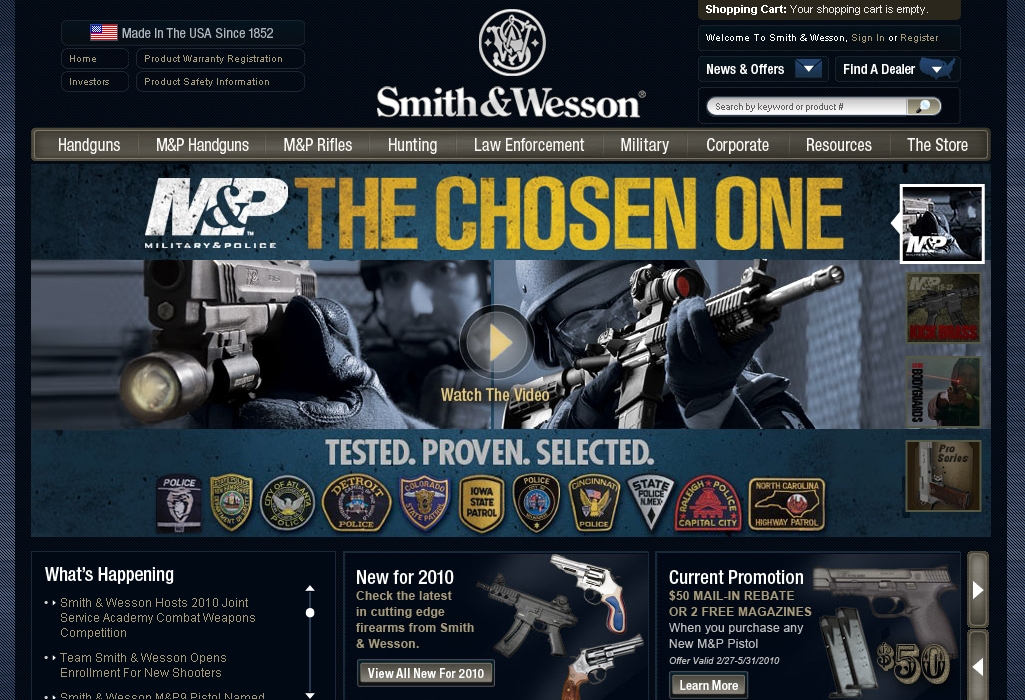
This looks what the website of one of America’s, and the world’s, best known brands should look like. And it follows closely, though not exactly, along the lines of the current best practices for website layout. But that certainly doesn’t diminish from its impact on web surfers.
High Points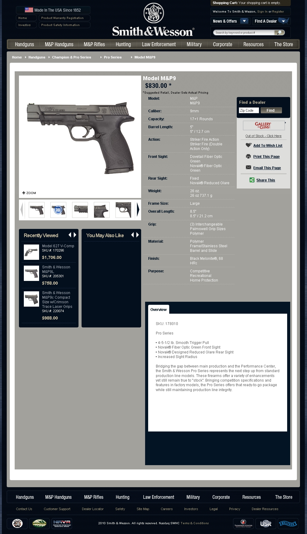
Much improved navigation over the old site. It’s much easier to find a product you are looking for, which in the case of Messrs. Smith and Wesson is daunting given their long history and broad product range.
Homepage looks great and uses strong colors without being overly dark like a lot of websites that get heavy handed with the use of black.
Graphics are good. S&W has utilized better graphics in their ads and P.O.S. but these never fully made it over to the website and certainly didn’t help define the site. Not the case here.
Dealer Resources section provides a full library of product spec sheets as well as what I assume is product shots of all their firearms. I can’t tell you how useful this is to dealers with websites that need good images of their inventory. S&W has always done a fairly good job of this but I don’t recall it being this easy to find and navigate. I’ll be using this feature quite a bit in the future.
Low Lights
There isn’t much that I can complain about after this first brief review this morning. But three things do jump out. The first is photography. The product images are not that great. Photography is expensive and it is tricky to get good shots of guns if you are not familiar with photographing firearms – just like it’s hard to photograph jewelry. The images seem to me to be flat. While it may not be practical to make each and every shot a beauty shot, at least one should really stand out, particularly with the higher end products or hot sellers. 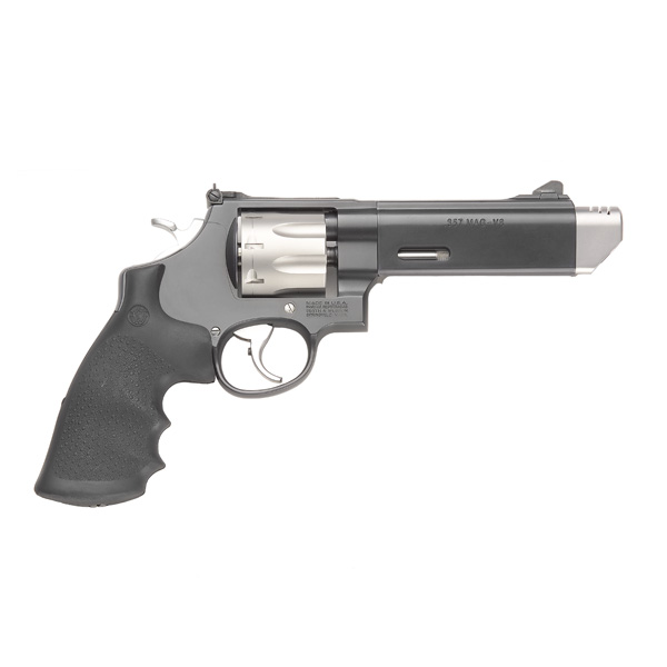
For instance, I covet a 627 V-Comp to be tricked out by master gunsmith Randy Lee. It’s a secret desire that’s not so secret anymore. This is a gun that from the factory carries an MSRP of $1,706. It’s a flagship kind of revolver, at least for the competition market. It deserves a sweet beauty shot that makes me want to part with $1,706 and not ask myself “why the hell did I just do that.” It’s a good looking gun that should look great in its main shot online. S&W has the photo talent to do this type of shot in photographer Yamil Sued. He’s a friend of mine and his work never fails to impress. Hopefully Messrs. Smith and Wesson will think about adding new pics over time to spruce up this aspect of the site.
The second item is a huge pet peeve of mine and it’s something near and dear to my heart – press releases. I cannot find a direct link to the newsroom/press release area, and maybe that’s because I’m overlooking it or I’m just plain stupid. The lower left under the main image area hosts the “What’s Happening” section and links to individual releases. Now here’s the problem…the links take you to the PDF of the release. I firmly believe that all press releases should be in an HTML format on the site. As a PDF I cannot easily search for these and the PDF itself carries no logo or branding. What’s the point of that? There may be some high level corporatey thing going on where they don’t want them in HTML because they can be searched but since S&W is publicly traded, their releases are on the web already on stock trading and finance sites.
The final item is a lack of emphasis on social media integration. Smith has a twitter account and a facebook page, both of which I follow, but you would not know this fact if you land on their homepage. Not sure why this is other than some publicly traded companies have problems jumping into the deep end of the social media pool. Usually this doesn’t come from the marketing dept., but the investor relations side. I have no idea what the internal reason are for this omission, and it could just be a function of the site still being a work in progress, but I hope they make this easy fix quickly.
All-in-all this is a very good looking site and the low points I described are not indicative of any overall fail on the part of S&W and it’s marketing team. The hard part, the hurdle of getting this beast of a site up and running is now cleared and they can concentrate on building more content. Hopefully this is the first step in the creation of what will be a robust and dominant internet hub for all things Smith & Wesson.
8 Responses to Praise The Lord! S&W Has A New Website
You must be logged in to post a comment Login

 MidwayUSA
 Ruger Firearms
 SCCY Firearms
 Streamlight
 Action Targets
 Gunsite Academy
Pingback: More on Smith & Wesson’s new website « Gun Nuts Media
Pingback: SayUncle » S&W
Pingback: S&W’s New Web Site Still Needs Better Photo Editing | Les Jones
Pingback: GunClub | Blog | Praise The Lord! SW Has A New Website